
Summer / Vintage
Vintage muted color palette
Five colors, three design directions. Compare the applications, check contrast, and take the CSS into your own project.
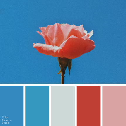
The palette
Click a hex to copyRGB & CMYK values
| Color | Hex | RGB | CMYK (approx.) |
|---|---|---|---|
| Clear Sky | #348ABF | 52 138 191 | 73 28 0 25 |
| Lagoon Blue | #3498BF | 52 152 191 | 73 20 0 25 |
| Mist Gray | #CCD9D7 | 204 217 215 | 6 0 1 15 |
| Faded Vermilion | #BF3F34 | 191 63 52 | 0 67 73 25 |
| Dusty Rose | #D9A3A3 | 217 163 163 | 0 25 25 15 |
FROM INSPIRATION TO APPLICATION
A palette is a starting point. Here is what to make with it.
Try this rose-and-sky combination on three different formats, compare the balance, and take away a usable set of color roles—not just five swatches.
Same five colors. Three ways to use them.
Change the dominant color and see how the mood shifts.
kind of everyday.
Small objects. Lasting rituals.
Explore the collection ↗01 / A small studio website
Let the surface do the quiet work. Use red for one important action, rather than every link.
BLOOM
02 / A typographic poster
Use blue as a large graphic field. Repeat the warm red in one focal shape and let type stay simple.
STUDY
Everyday objects,
thoughtfully wrapped.
color.
03 / A small product carton
Put a soft shade on the broad face and use blue for the side panel. Test the colors on your actual stock.
Original design studies for this guide. Product names and layouts are illustrative.
Give every color a job.
A balanced starting point—not a rule for every project.
#CCD9D7Page backgrounds, quiet panels, and breathing room.
#348ABFA large graphic, a side panel, or a consistent brand area.
#BF3F34One call to action or one focal detail.
#D9A3A3A supporting illustration, small label, or warm detail.
#3498BFSmall rules or details that connect back to the main blue.
Add a supporting ink such as #111111 for reading text. The five inspiration colors do not have to do every job.
A pretty pairing can still be hard to read.
Keep the background. Change the text color.
Below the 4.5:1 threshold for normal text.
Meets the 4.5:1 normal-text contrast threshold.
White on the vermilion action color is 5.28:1. These checks cover the stated solid-color pairs, not every element of a finished design. WCAG contrast guidance ↗
Take the roles into your project.
Starter CSS for the neutral-led version, including readable supporting text colors.
/* Vintage rose: balanced starter. Ratios are a design starting point. */
:root {
  --rose-background: #CCD9D7; /* base surfaces */
  --rose-brand: #348ABF;      /* identity and large graphic areas */
  --rose-secondary: #3498BF;  /* small supporting details */
  --rose-accent: #BF3F34;     /* important actions */
  --rose-soft: #D9A3A3;       /* soft emphasis */
  --rose-ink: #111111;        /* supporting neutral for readable text */
  --rose-on-accent: #FFFFFF;
}
.rose-panel { background: var(--rose-background); color: var(--rose-ink); }
.rose-button { background: var(--rose-accent); color: var(--rose-on-accent); }
Choose the version that fits the job.
Start neutral-led when reading content matters most, blue-led when you need a stronger graphic identity, or rose-led for a softer material direction. Keep red selective. For print, ask for a proof on the actual paper; the CMYK values here are mathematical estimates, not a printer-specific conversion.
Photo by Aleksandar Kyng on Unsplash. Color studies and application notes by Color Scheme Studio.