
Color 101 / Practical color decisions
How to use bright accents on dark backgrounds
The glow in a photograph comes from light and shadow. A flat layout needs its own plan for surfaces, text, and the one thing that should stand out.
Use a restrained dark field, reserve the brightest accent for a meaningful destination, and choose text colors by measurement. Add a separate reading neutral when the five photo colors do not cover every job.
The photo’s glow is a relationship you can borrow
The amber-lit glass in our source photograph sits in a large dark area. Small yellow lights repeat around it, but the glass remains the main event. In a layout, that suggests a useful hierarchy: a quiet field, a warm supporting shape, and one bright destination.
A solid yellow rectangle will not glow like photographed light. It can still look emphatic against deep plum. Keep that distinction clear when translating the image: you are borrowing the contrast and concentration of light, not promising a lighting effect from a HEX code.
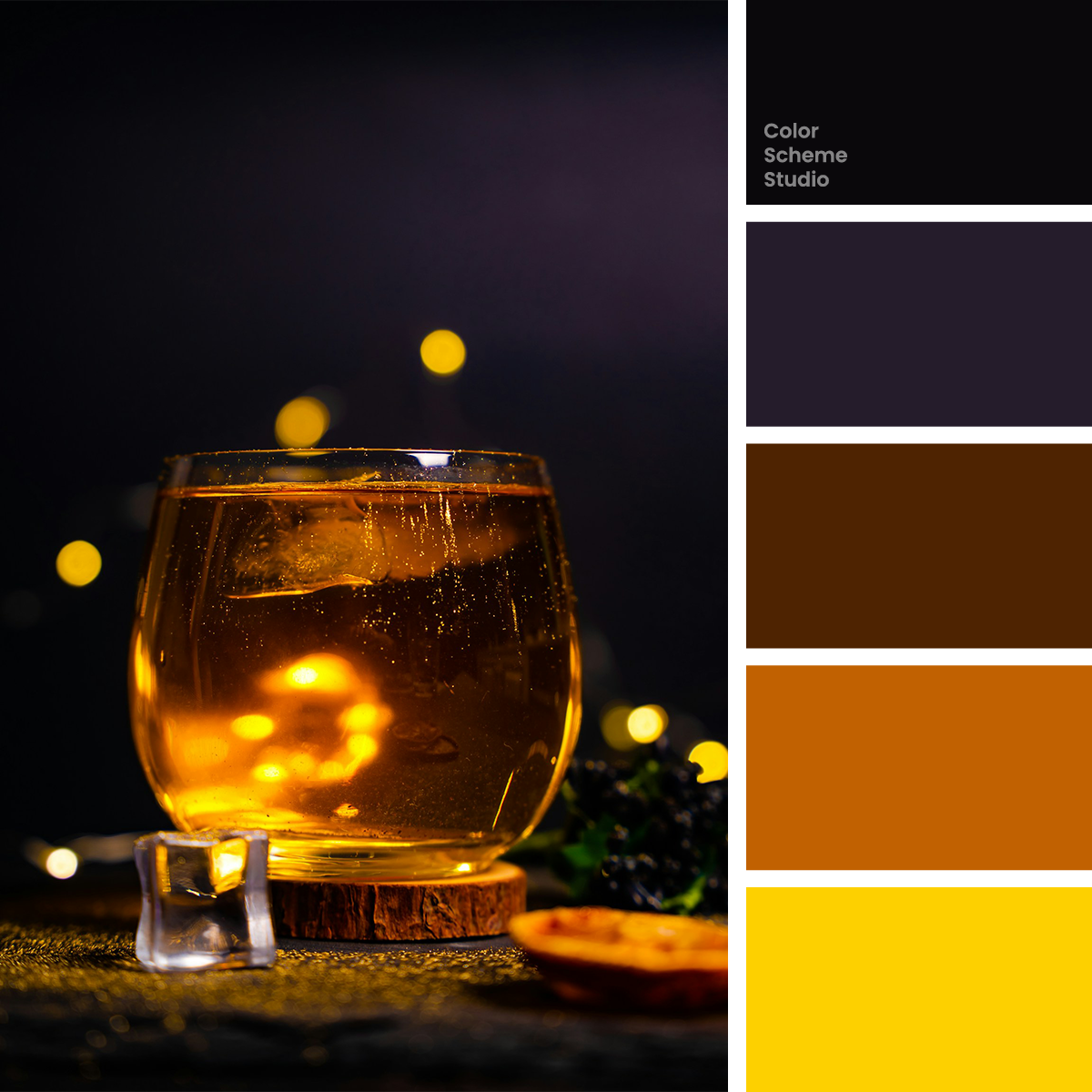
Autumn amber color palette
Compare an evening page, an invitation, and a seasonal gift sleeve built from the same colors.
Explore the palette →Do not ask three dark colors to create three obvious levels
Midnight Ink, Velvet Plum, and Burnt Caramel are all dark. They describe different shadow colors, but adjacent panels made from them may merge in an ordinary viewing situation. A subtle color change alone is a weak way to identify an important boundary.
Use spacing, a clear heading, or a visible rule when two sections need separation. Let the plum field establish the mood; give the ink a framing or lettering role. Caramel can become an illustration shape without also being a text background. You do not need five stacked dark panels just because the palette contains five colors.
For long descriptions, introduce a checked light neutral and a dark reading color. It is reasonable to extend a photo palette with a functional neutral. Explain the addition in a design handoff rather than treating the original five swatches as a complete interface system.
Check the words inside the accent
Select an exact pair. The ratio is calculated from the solid sRGB values, and the verdict uses the unrounded result. A passing pair here does not verify an entire page, the focus state of a control, or text placed over the photograph.
13.49:1 · Meets AA for normal text.
Normal text: at least 4.5:1. Large text: at least 3:1 under WCAG’s definitions. Decorative color areas have a different job from reading text.
Why the gold button needs dark lettering
White on Lantern Gold reaches only 1.48:1. Midnight Ink on that same gold reaches 13.49:1. The attractive yellow does not rescue the white text. Change the foreground to ink and retain the gold as the action surface.
Copper is a separate decision
White on Copper Glow reaches 4.22:1, while Midnight Ink on copper reaches 4.73:1. Do not copy the gold treatment to copper without checking its result. A palette can contain two warm colors that require different text decisions.
Build a small event card before a full dark page
- Write the real message. Put the event name, short description, and one action into the card. A decorative headline alone will not reveal whether the system handles useful information.
- Choose a dark field. Start with plum rather than switching between all three darks. Keep text on a plain surface so the photograph can remain atmospheric.
- Make one action unmistakable. Try a gold action with ink lettering. Give a secondary action a quieter treatment and a clear text label, rather than another equally strong gold block.
- Check the less exciting information. Dates, locations, captions, and keyboard focus deserve as much care as the headline. Avoid lowering text opacity just to make it feel secondary; measure the actual resulting pair.
Then view the card at the size it will actually appear. A large mockup can hide the weak separation of two dark surfaces, while a tiny preview can hide an unreadable caption. Keep information hierarchy in type size, spacing, and wording as well as color.
Keep the accent special when you add more content
A single event can have one primary booking action. A grid of twelve events changes the problem: twelve gold blocks can compete for attention. Try a dark text link on each card and a bright action only where someone has made a choice, or keep the repeated actions compact and reduce other yellow decoration.
There is no required percentage for gold. The test is whether the important destination remains apparent. Remove the decorative gold border, icon, or repeated heading before choosing an even brighter color. Increasing brightness is rarely a useful answer when every component is already asking to lead.
A printed dark surface will not behave like a lit screen
A screen emits light; ink on paper does not. Deep plum, black, and brown may lose some of their visible separation in a printed piece, and the yellow may look less luminous. The paper, inks, output profile, and viewing light influence that result.
Keep an editable master, request the printer’s production specification, and inspect a proof when the shadow detail matters. The palette’s mathematical CMYK estimates are reference values, not approved ink recipes. Our HEX, RGB & CMYK guide explains the handoff in more detail.
References and scope
The event and sleeve suggestions are original illustrative studies. Contrast ratios follow the sRGB relative-luminance method described in W3C: minimum text contrast. For accessible meaning beyond color, see W3C: use of color. For the separate print workflow, see Adobe: printing with color management in Illustrator.