Autumn / Vivid
Autumn amber color palette
A dark plum backdrop and amber light make a compact, glowing palette. Explore it in an evening event page, a printed invitation, and a gift sleeve.
The palette
Click a hex to copyRGB & CMYK values
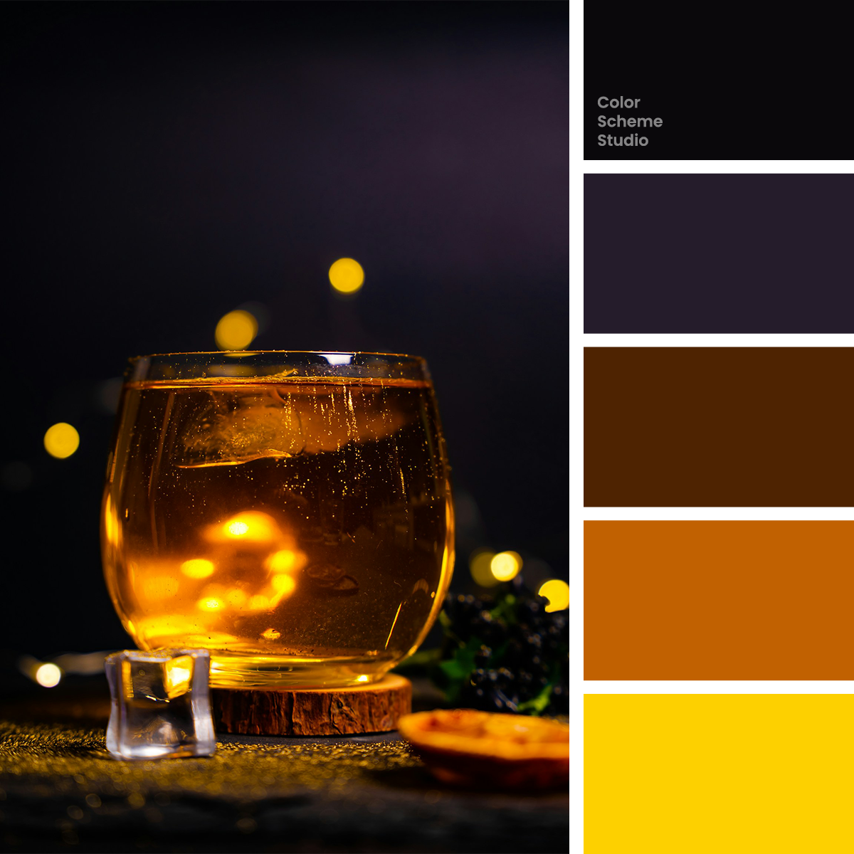
| Color | Hex | RGB | CMYK (approx.) |
|---|---|---|---|
| Midnight Ink | #0A080B | 10 8 11 | 9 27 0 96 |
| Velvet Plum | #251C2B | 37 28 43 | 14 35 0 83 |
| Burnt Caramel | #4E2301 | 78 35 1 | 0 55 99 69 |
| Copper Glow | #C16101 | 193 97 1 | 0 50 99 24 |
| Lantern Gold | #FDD000 | 253 208 0 | 0 18 100 1 |
FROM INSPIRATION TO APPLICATION
Make space around the glow.
In Akram Huseyn’s photograph, the glass holds a concentrated pool of amber light. The background is almost black, with a plum cast in the upper right; small gold highlights repeat around the glass. That contrast is the useful idea. The yellow looks luminous because it is surrounded by much darker color. A page filled with yellow would tell a different story, even though it used the same five swatches.
Use the light to give each piece a destination.
An evening event page can use a small gold action, an invitation can give the title a lit edge, and a gift sleeve can place one warm seal on a dark face. The purpose is not to reproduce a glowing photograph with flat fills. It is to translate the relationship between a quiet field and a concentrated highlight into a useful hierarchy.
the glow.
An evening of conversation and light.
View the evening ↗01 / An evening event page
Give the event title a quiet plum field and reserve gold for a single booking action. Put a longer programme on a separate light surface with dark body text.
HOUR
02 / An intimate invitation
Let the headline do most of the work. Copper and caramel can build an abstract light motif below it; gold marks the detail you want someone to remember.
LIGHT
A little warmth
to take home.
edition.
03 / A seasonal gift sleeve
Use copper for the front, caramel for the side, and a small gold seal with dark lettering. Keep product information on a separate, high-contrast label.
Original illustrative design studies, not real businesses, event announcements, or production packaging files.
Save the brightest color for the smallest job.
Try Velvet Plum 50%, Midnight Ink 25%, Burnt Caramel 15%, Copper Glow 8%, and Lantern Gold 2%. Plum gives the dark layout a little character; ink gives it a deeper edge. Caramel and copper suggest the amber glass without requiring a large yellow area. Gold identifies one action or mark. This balance suits a compact cover or invitation better than a long page made entirely from dark panels.
#251C2BA dark cover surface with a subtle purple undertone.
#0A080BFraming, dark-on-gold lettering, and a secondary dark panel.
#4E2301A broad illustration shape or the shaded side of a sleeve.
#C16101A supporting graphic, band, or small illustration.
#FDD000One primary action, short headline, or compact seal.
Gold is a background that asks for dark text.
White on yellow may suggest sparkle, but it makes small words difficult to read. Compare white and Midnight Ink on Lantern Gold. For an event page, use the dark lettering on a gold booking action. Add a light reading neutral for longer descriptions rather than forcing copper or gold into every paragraph.
Below AA for normal text.
Meets AA for normal text.
The WCAG AA minimum for normal text is 4.5:1. Ratios describe these exact solid-color pairs, not the whole page or text over the photograph. How to use bright accents on dark backgrounds →
Take this color direction into your project.
Start with named roles, then check each new text and surface pairing.
/* Autumn amber color palette: sRGB starting values, not print specifications. */
:root {
  --amber-surface: #251C2B;
  --amber-ink: #FDD000;
  --amber-support: #4E2301;
  --amber-detail: #C16101;
  --amber-accent: #FDD000;
  --amber-on-accent: #0A080B;
}
.amber-cover { background: var(--amber-surface); color: var(--amber-ink); }
.amber-action { background: var(--amber-accent); color: var(--amber-on-accent); }
/* Add a checked reading surface for extended body copy. */
Protect the highlight as the design grows.
When you add a second event card, resist giving every label a gold rectangle. Keep one primary action distinct, then use a quieter text link for secondary choices. A dark invitation can carry little text well; a full schedule needs a separate reading area. The printed version will not emit light like the screen. Ask for a proof before relying on deep shadow detail or a luminous-looking yellow.
Photo by Akram Huseyn on Unsplash. Color studies and application notes by Color Scheme Studio.