Winter / Neutral
Winter muted color palette
A quieter winter palette from snow-covered leaves and warm berries, with ideas for seasonal journals, gathering invitations, and botanical gifts.
The palette
Click a hex to copyRGB & CMYK values
| Color | Hex | RGB | CMYK (approx.) |
|---|---|---|---|
| Snow Veil | #D1D2D4 | 209 210 212 | 1 1 0 17 |
| Winter Sage | #737E67 | 115 126 103 | 9 0 18 51 |
| Deep Evergreen | #33462F | 51 70 47 | 27 0 33 73 |
| Frosted Berry | #BB5041 | 187 80 65 | 0 57 65 27 |
| Amber Twig | #AD713B | 173 113 59 | 0 35 66 32 |
FROM INSPIRATION TO APPLICATION
A quieter take on winter color.
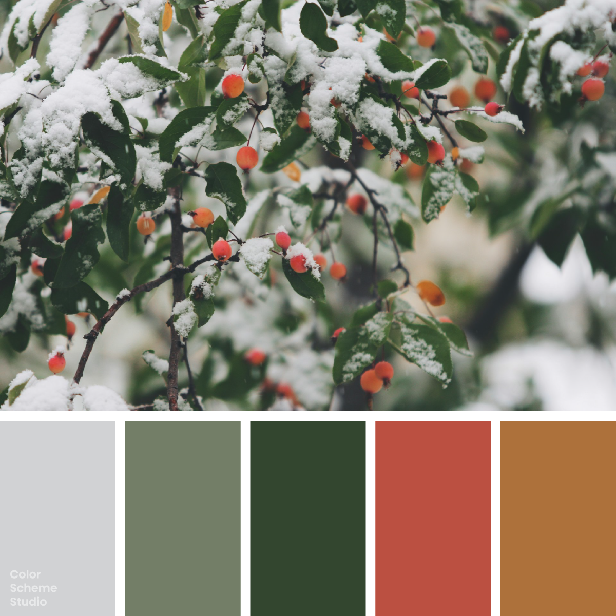
In John Price’s photograph, the snow is a soft gray rather than a brilliant white. Green leaves hold the scene together, and the berries supply small pockets of warmth. Keep that relationship in the design: broad quiet surfaces, a dark green structure, and red used sparingly. This palette suits a seasonal project that should feel thoughtful rather than festive at full volume.
Build the season around the quiet colors.
Three seasonal formats, with different amounts of green.
everything slows.
Notes from a quieter season.
Read the winter story ↗01 / A seasonal journal
Give the photograph a pale margin and use evergreen for the masthead. A single red reading link can stand out without surrounding the berries with more red.
TABLE
02 / A gathering invitation
Try a green-led cover with a pale main message. Keep the event details in one clear reading area and use the berry motif once, rather than as a repeated border.
LEAVES
A small gift
from the garden.
edition.
03 / A botanical gift carton
Put sage on the front and dark green on the side. Let the red seal identify the seasonal edition; place ingredients or other small information on a separate light label.
Original seasonal design studies. Names, layouts, and packaging are illustrative; the carton is not a production dieline.
Let snow and leaf colors do most of the work.
The warm berries are accents because they occupy small, memorable places.
#D1D2D4A quiet margin around photography and longer reading areas.
#33462FReading text on gray, mastheads, or a large invitation field.
#737E67An illustration layer or a broad face on a gift carton.
#BB5041The journal’s main action, one invitation motif, or a small seal.
#AD713BA fine divider or a small detail that echoes the stems.
These areas are a starting sketch, not measurements from the photograph. If the photo dominates the page, reduce the surrounding red and amber first. Otherwise the accents can compete with the berries that inspired them.
Pale snow needs a dark reading color.
The same gray surface, with two very different reading results.
Too little contrast for normal reading text.
Meets the AA normal-text threshold of 4.5:1.
White on Frosted Berry reaches 4.84:1, but white on Winter Sage reaches only 4.28:1. Do not carry the white-on-red treatment across to sage without checking it. These figures apply to the exact solid-color pairs shown. Text contrast reference ↗
Keep the winter roles together in your CSS.
A light surface, evergreen reading color, and berry-red action for the journal direction.
/* Snowy berries: an sRGB starting palette. Print values need an output profile. */
:root {
  --winter-surface: #D1D2D4;
  --winter-support: #737E67;
  --winter-ink: #33462F;
  --winter-accent: #BB5041;
  --winter-detail: #AD713B;
  --winter-on-accent: #FFFFFF;
}
.winter-card { background: var(--winter-surface); color: var(--winter-ink); }
.winter-action { background: var(--winter-accent); color: var(--winter-on-accent); }
Choose the surface for the message.
For a photo-led journal, begin with the pale version and let the image provide much of the warmth. For a compact invitation, try the green-led version with light text. On a sage carton, use dark lettering and keep small information on a light label. Before printing, confirm the output profile and inspect a proof on the chosen stock; the CMYK values supplied here are approximate conversions.
Photo by John Price on Unsplash. Color studies and application notes by Color Scheme Studio.