Winter / Neutral
Winter blue color palette
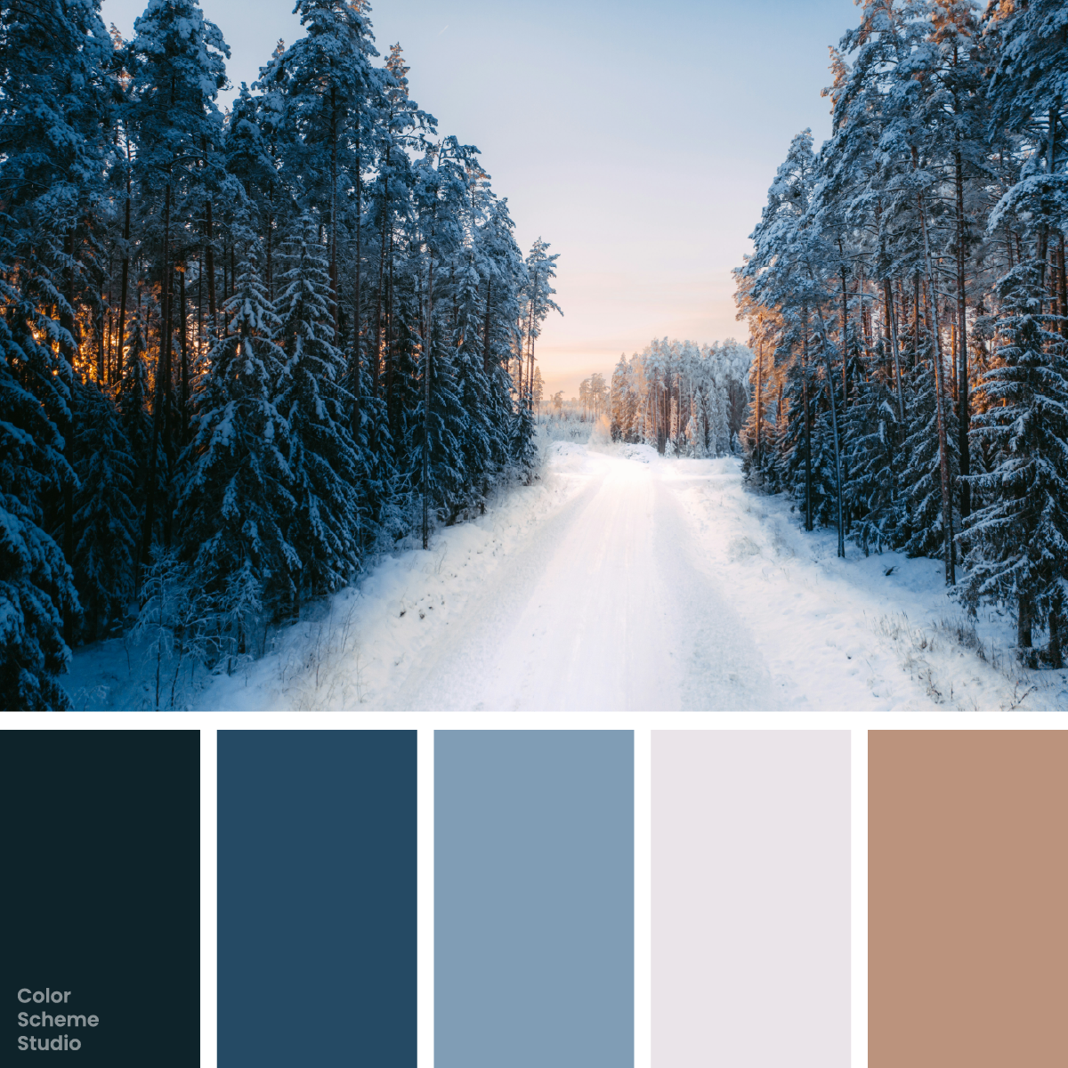
Snow-blue trees, a pale forest path, and a small trace of sunset. Try this winter palette in a walking journal, a trail notice, and a paper goods sleeve.
The palette
Click a hex to copyRGB & CMYK values
| Color | Hex | RGB | CMYK (approx.) |
|---|---|---|---|
| Pine Shadow | #0E232A | 14 35 42 | 67 17 0 84 |
| Nordic Blue | #254A64 | 37 74 100 | 63 26 0 61 |
| Frost Blue | #809DB5 | 128 157 181 | 29 13 0 29 |
| Snow Pearl | #EAE4E9 | 234 228 233 | 0 3 0 8 |
| Sunset Clay | #BB937D | 187 147 125 | 0 21 33 27 |
FROM INSPIRATION TO APPLICATION
Let the path stay light.
Krists Luhaers’s forest photograph has a clear route through the color: dark trees frame the edges, blue snow fills the middle distance, and the pale path opens toward the horizon. The small peach glow stops the scene from becoming a single cold mass. Borrow that arrangement rather than covering a page with equal blue and peach panels. Use the pale color where people read, dark pine where the design needs definition, and clay where the eye should pause.
Three ways to bring the forest into a layout.
A walking journal needs space for photographs and observations. A trail notice needs an immediately visible destination. A paper sleeve needs a recognizable face even before someone reads the small print. These studies use the same colors for those different jobs. Compare a snow-led layout with deeper blue and frost-blue surfaces; the size of the text area matters as much as the mood.
quiet path.
Walks, notes, and winter light.
Open the journal ↗01 / A winter walking journal
Use Snow Pearl behind observations and Pine Shadow for the text. Let Nordic Blue frame one image rather than building a heavy border around every entry.
TRAIL
02 / A trail notice
A blue-led sheet can announce a short route clearly. Put the route marker in clay with dark lettering, and keep safety or access information in a separate, readable block.
NOTES
A place for
small observations.
edition.
03 / A paper goods sleeve
Use frost blue for the broad sleeve and deep blue for its side. A small clay tab distinguishes the edition without making the whole object look warm.
Original illustrative design studies, not real businesses, event announcements, or production packaging files.
Build depth before adding warmth.
Start with Snow Pearl 50%, Nordic Blue 24%, Pine Shadow 14%, Frost Blue 9%, and Sunset Clay 3%. The two dark colors perform different jobs: pine carries reading text, while the middle blue separates a cover or panel. Frost Blue joins those depths to the pale surface. Clay is a short interruption, like the light between the trees. The percentages are a layout sketch, not sampled image coverage.
#EAE4E9Reading areas and margins around a busy forest photograph.
#254A64A journal cover, a sign panel, or the side of a sleeve.
#0E232ABody text, the route title, and fine rules on pale areas.
#809DB5An illustration layer that joins pale snow to deeper blues.
#BB937DA route number, a small tab, or a short callout.
A warm label still needs dark lettering.
Sunset Clay looks distinct from the blue family, but that hue difference does not make white words readable. Compare white and Pine Shadow on exactly the same clay surface below. Keep trail instructions on a plain panel instead of placing them over the busy branches. The image can convey atmosphere while the text panel does the practical work.
Below AA for normal text.
Meets AA for normal text.
The WCAG AA minimum for normal text is 4.5:1. Ratios describe these exact solid-color pairs, not the whole page or text over the photograph. How to combine warm and cool colors →
Take this color direction into your project.
Start with named roles, then check each new text and surface pairing.
/* Winter blue color palette: sRGB starting values, not print specifications. */
:root {
  --forest-surface: #EAE4E9;
  --forest-ink: #0E232A;
  --forest-support: #254A64;
  --forest-detail: #809DB5;
  --forest-accent: #BB937D;
  --forest-on-accent: #0E232A;
}
.forest-cover { background: var(--forest-surface); color: var(--forest-ink); }
.forest-action { background: var(--forest-accent); color: var(--forest-on-accent); }
/* Add a checked reading surface for extended body copy. */
Keep a route through the page.
For a journal, carry the pale path into the margins and reading area. For a short trail notice, let blue occupy more of the sheet and use a clay marker once. On a paper sleeve, keep the small product details on a pale inset label. If you add another photograph, reassess the warmth: a second sunset can make a separate peach panel unnecessary. Print colors need an agreed output profile and a proof; the CMYK estimates here are not a production recipe.
Photo by Krists Luhaers on Unsplash. Color studies and application notes by Color Scheme Studio.