
Color 101 / Practical color decisions
How to combine warm and cool colors
A small warm detail can change a cool composition. The useful question is where it belongs, and what you want it to do.
Choose a dominant color family for the setting, then give the contrasting temperature one specific job. Check the actual text pairs separately; “warm” and “cool” do not tell you whether words are readable.
Read temperature as a relationship
Designers often call blues and blue-greens cool, and oranges or yellow-reds warm. Those labels help describe a relationship inside a composition. They do not specify a color value, a physical temperature, or a guaranteed emotional response. A blue can lean greener or more violet; a pale gray can look warmer beside one blue than another.
Begin by comparing your actual swatches together. In our forest palette, Nordic Blue and Frost Blue form the cool family. Sunset Clay is a restrained peach-brown that looks warm beside them. Snow Pearl is a very pale, slightly tinted surface; it does not need to be pure white to give the page breathing room.
This is a practical reading of this photograph, not a universal promise that blue always feels calm or that orange always feels friendly. The subject, wording, shapes, and context also shape the result.
Find what the warm color is already doing
The forest photograph contains a small area of warm light near the horizon. The trees frame that opening, and the pale path leads toward it. The warm patch has a location and a reason to be noticed. Copying a peach swatch into every button, border, and card would lose that relationship.
For a walking journal, use dark pine for the headline and a pale reading surface. The image can supply the warmth on its own. A clay tab might help identify a route or a section, but it should earn its place. A palette is permission to choose among the colors, not an instruction to use all five everywhere.
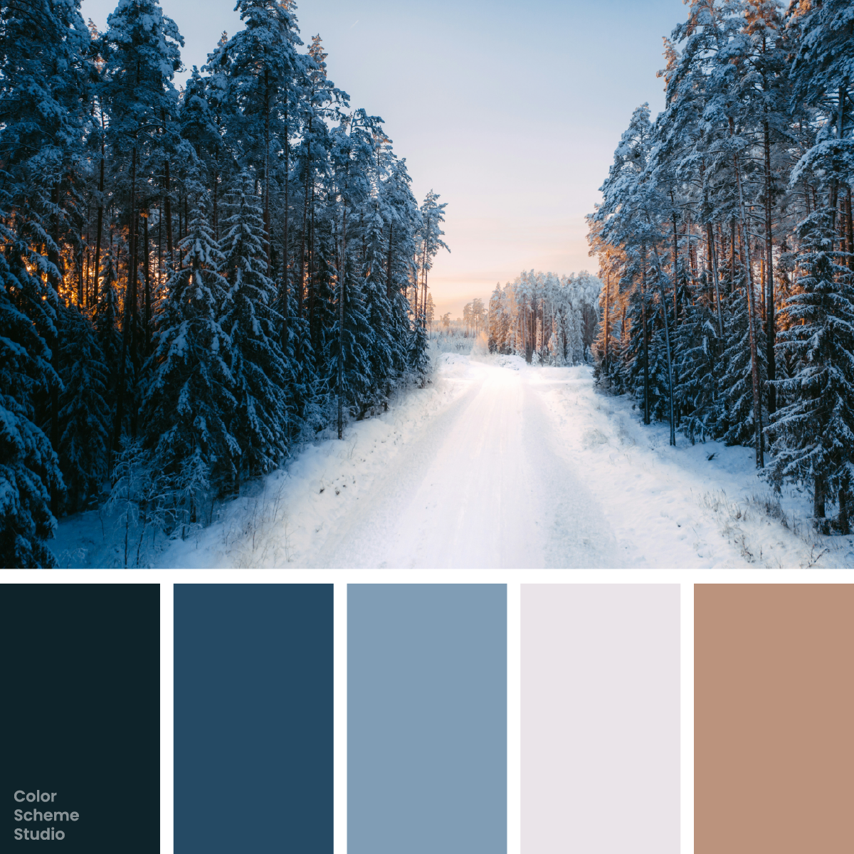
Winter blue color palette
See the source image, five exact colors, and journal, trail, and paper goods studies.
Explore the palette →Compare placement, not just swatches
The short card below uses the same message in three arrangements. Switch the direction and notice which part gets your attention. The layouts are design experiments, not recommendations for a fixed percentage.
A small collection of walks and observations.
Route 01 →Cool setting: blue defines the large field. The pale text and dark route label keep the reading roles distinct.
The warm-setting version gives clay the largest area. It becomes the atmosphere of the card rather than an accent. Neither direction is automatically better: a winter field journal may benefit from the cool setting, while a personal invitation could reasonably lead with the warmer surface.
A four-decision workflow
- Choose the setting. Decide whether the project should lead with blue, a pale reading surface, or clay. Make this decision for a real format: a cover can carry a larger color field than a text-heavy article.
- Give the opposite temperature a job. Try one route marker, edition tab, or illustration detail. If it adds no useful distinction, leave it out of that layout.
- Include the photograph in the composition. Hide the separate clay shape briefly. If the horizon still gives you enough warmth, you may not need another accent around it.
- Compare the same content. Keep the words, type sizes, and spacing stable while changing the color placement. Otherwise you cannot tell which decision improved the card.
After that first comparison, test a narrow screen. A small side panel can become a long block when columns stack, giving the warm color far more presence than it had on desktop. Adjust its size or placement for that layout.
Temperature cannot substitute for text contrast
A peach label on a blue field may be easy to spot, yet the white words inside the peach label can still be hard to read. White on Sunset Clay is 2.77:1. Pine Shadow on the same clay is 5.87:1. Use the dark lettering for normal text on that surface.
WCAG AA asks for at least 4.5:1 for normal text and 3:1 for large text under its definitions. Compare exact foreground and background values. A different hue family, a bigger surrounding panel, or a stronger photograph does not change the contrast of that pair.
Do not make “warm route” and “cool route” the only way to distinguish choices. Include a name, route number, or another visible cue. Color should support the information rather than carry it alone.
Before you settle on the combination
- Can you point to the dominant family without counting the swatches?
- Does the warm detail identify something, or has it spread across every component?
- Does the photograph already provide the contrasting temperature?
- Are reading colors checked on every surface, including small labels?
If the layout feels unsettled, remove one repeated accent before changing the whole palette. If it feels too cold for your purpose, test a larger warm surface on one format rather than adding many scattered peach marks.
For a broader area-balance exercise, continue with balancing a five-color palette. Temperature describes a relationship; roles and placement turn that relationship into a design.
References and scope
The temperature descriptions and layout studies are Color Scheme Studio’s interpretation of this palette. For measurable reading requirements, see W3C: minimum text contrast. For keeping meaning available beyond hue, see W3C: use of color. The source photograph and photographer credit are linked in the full palette post.