
Color 101 / Color in practice
How to balance a five-color palette
A palette tells you which colors could work together. A layout asks a different question: how much of each color belongs here?
Choose a dominant surface, a readable text color, a supporting color, and one main accent. Give the remaining color a small role—or leave it out. Equal swatches are a reference, not a layout instruction.
Why five equal swatches can feel different in use
A small red square and a large red background create very different experiences. A saturated accent can attract attention even when it occupies a small area. A quiet gray can cover much more space without becoming the focal point. Scale, saturation, contrast, position, and surrounding content all affect what people notice.
This is why copying five colors into five equally sized blocks rarely answers the design problem. The blocks show the ingredients. Your layout decides which ingredient leads.
Start with a role for each color
Using our snowy berries palette, begin with these assignments. They are a useful first draft, not fixed meanings for the colors.
| Role | Starting color | What it does |
|---|---|---|
| Main surface | Snow Veil · #D1D2D4 | Gives content a quiet field. |
| Text & structure | Deep Evergreen · #33462F | Anchors headings, reading text, and large graphic areas. |
| Support | Winter Sage · #737E67 | Separates an illustration or secondary panel. |
| Primary accent | Frosted Berry · #BB5041 | Highlights one action or focal detail. |
| Small detail | Amber Twig · #AD713B | Adds a restrained warm echo. |
One color can have more than one role. Deep green can be both the reading color and a broad illustration field. You may also need a supporting neutral outside the five swatches. Keep that addition intentional rather than forcing an unsuitable palette color into small text.
Compare three starting balances
Switch between these area sketches. Each uses the same five colors. Notice how the mood changes as the dominant color changes.
- Snow Veil
- 55%
- Deep Evergreen
- 25%
- Winter Sage
- 12%
- Frosted Berry
- 6%
- Amber Twig
- 2%
Quiet surface: start here for a page with a lot of reading. The pale gray gives content room, and the red remains selective.
These percentages describe illustrative color areas. They are not accessibility scores, measured image coverage, or rules you need to calculate for a finished page.
What about the 60–30–10 rule?
The familiar dominant–secondary–accent split can help you escape equal proportions. Treat it as a prompt to establish hierarchy, not a requirement. With five colors, you can split a supporting area into two shades or reserve a tiny share for a detail. You can also use only three of the five colors when that serves the work.
Make one small layout before extending the system
- Place the real content first. Use the actual headline, body copy, image, and action. Placeholder content can hide how much space the design needs.
- Choose one large surface. Begin with the pale gray for a reading page or the deep green for a more graphic invitation. Keep the number of competing backgrounds small.
- Give the warm accent a job. Try the berry red on one primary button or one meaningful motif. If every card and heading gets the same accent, the important action becomes harder to distinguish.
- Add support only when needed. Use sage to separate a panel, then decide whether the amber detail contributes anything. Removing a color is a valid design decision.
At this stage, compare a desktop-sized view and a small screen. When columns stack on a phone, a supporting panel may become a much longer block of color. Adjust the application at that breakpoint instead of assuming the desktop balance will carry over unchanged.
Let the photograph count as color
A photo is not an empty rectangle in your color system. The winter image already contains dark leaves, pale snow, and warm berries. If you surround it with equally strong red and amber panels, those accents can compete with the image.
Try a gray background and a green heading first. Let the berries inside the photo provide some of the warmth. Add a separate red accent only if the layout still needs an obvious action or destination.
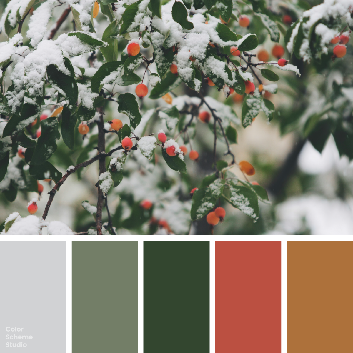
Winter muted color palette
Website, invitation, and packaging studies with exact color values.
Explore the palette →Visual balance and text contrast are separate checks
A small accent can look well balanced and still be a poor text background. For this palette, Deep Evergreen on Snow Veil has a 6.75:1 contrast ratio. White on Winter Sage is 4.28:1, below the WCAG AA 4.5:1 threshold for normal text. Making that sage area smaller does not fix the contrast of the text inside it.
Check the exact foreground and background at the size and weight you plan to use. Keep meaning visible through wording, icons, or another cue as well as color. A red state should still be understandable when someone cannot distinguish it from a nearby green.
Review the composition with four questions
- Where does the eye go first, and is that the right place?
- Is there a clear reading color on each surface?
- Does the accent identify something important, or just appear everywhere?
- Would removing the smallest color make the layout clearer?
If the focal point is unclear, reduce the number of strong accents before adding another color. If the page feels flat, try a larger dark structural area or a more deliberate accent position. Change one decision at a time so you can tell what improved the result.
Further reading
The role assignments and area sketches above are Color Scheme Studio design examples. For the separate accessibility check, see W3C’s explanation of minimum text contrast and using color without relying on it alone. For digital and print specifications, continue with our HEX, RGB & CMYK guide.