
Color 101 / Soft color, clear text
How to keep muted color palettes readable
A gentle palette does not need faint words. Keep the atmosphere in your surfaces and give the message a separately checked foreground.
Softness describes the visual character of the palette. Readability depends on the particular foreground and background. Check the actual pair at the text’s intended size instead of assuming that a dark-looking swatch will work everywhere.
Borrow the quiet field, not the faint edge
Our frozen-bubble photograph contains pale crystal marks against several blue depths. The eye can enjoy that delicate edge without needing to read it as a sentence. A caption, date, or navigation label has a different job. Recreating the bubble’s pale edge as thin white text on a pale card confuses atmosphere with information.
Start by deciding which part of the design should feel gentle. It might be the surrounding blush, an inset of lavender, or the blue photograph itself. A darker text color can sit inside that quiet composition without making the whole palette harsh. Give the dark color a limited but dependable role.
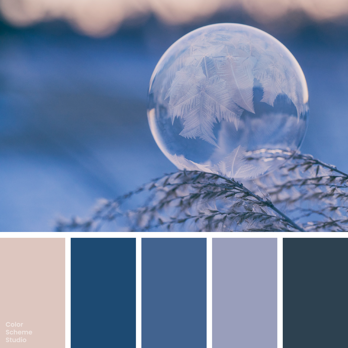
Winter frosted color palette
See the frozen-bubble image, five exact colors, and journal, card, and sleeve studies.
Explore the palette →Compare a pair, then change just one part
The examples below use exact solid colors from the frost palette, with #111111 added as a supporting ink. Change the pair and read the result. The two slate examples show why passing on one pale surface does not prove that the same foreground works on another.
1.63:1 · Below the 4.5:1 normal-text threshold.
| Solid-color pair | Contrast | Normal text |
|---|---|---|
| White on Thaw Blush | 1.63:1 | Below 4.5:1 |
| Winter Slate on Thaw Blush | 6.51:1 | Meets 4.5:1 |
| Winter Slate on Frost Lavender | 4.01:1 | Below 4.5:1 |
| Supporting ink on Frost Lavender | 7.16:1 | Meets 4.5:1 |
Winter Slate on Thaw Blush reaches 6.51:1, but the same slate on Frost Lavender reaches only 4.01:1. The color family is not the deciding factor; the measured pair changed. Use an unrounded result for a threshold decision.
Let colors do different kinds of work
A five-color inspiration palette is not a requirement that each color carry small text. Lavender may be a broad illustration field. Denim may organize a cover. Slate may handle notes on blush. If the composition requires text on lavender, adding a darker supporting ink is a practical choice, not a failure to stay faithful to the image.
Keep hierarchy in the wording and spacing as well. A darker date can still be secondary when it is smaller and placed below the headline. Reducing text opacity to make it look quiet changes its contrast; check that rendered foreground again rather than reusing the ratio for the fully opaque color.
For links, a consistent underline or other clear treatment helps separate an action from surrounding text. Avoid expecting a small shift between two similar blues to communicate every difference in meaning. Check the complete interaction in your final design, including focus and hover states.
Keep texture away from practical information
A ratio measured against a flat blush swatch says nothing about words crossing bright crystals and deep blue gaps. A photo can contain both backgrounds behind the same line. Use a solid reading panel or move the caption outside the image when the photograph has busy detail.
A translucent overlay is not a single reusable color specification either. Its visible result depends on the pixels underneath. Inspect the full text area at the final crop, or use an opaque panel when a clear solid-color pair is more important than showing texture behind the words.
A short workflow for a soft but readable card
- Write the real message. Add the longest likely title, the date, and one practical instruction before decorating the card.
- Choose the reading surface. Start with blush for the frost study, then pair it with checked slate lettering.
- Keep the atmosphere elsewhere. Put lavender in a decorative field and let blue organize the edges.
- Test a changed surface again. If lavender grows behind the words, choose a new checked foreground rather than relying on the blush result.
- Review the exported size. Thin lettering, reduced screenshots, and textured print can lose definition even when a basic solid-color calculation passes.
The WCAG AA minimum is 4.5:1 for normal text, with a 3:1 exception for qualifying large text. These checks do not certify an entire page, and changing a heading’s size does not fix a faint small caption. Keep the main text comfortable before relying on the lower large-text threshold.
References and scope
The layouts and selection workflow are original Color Scheme Studio studies. The photograph is by Aaron Burden on Unsplash. Thresholds and the distinction between normal and large text follow W3C’s minimum text contrast explanation. For color notation, see HEX vs RGB vs CMYK.