Winter / Pastel
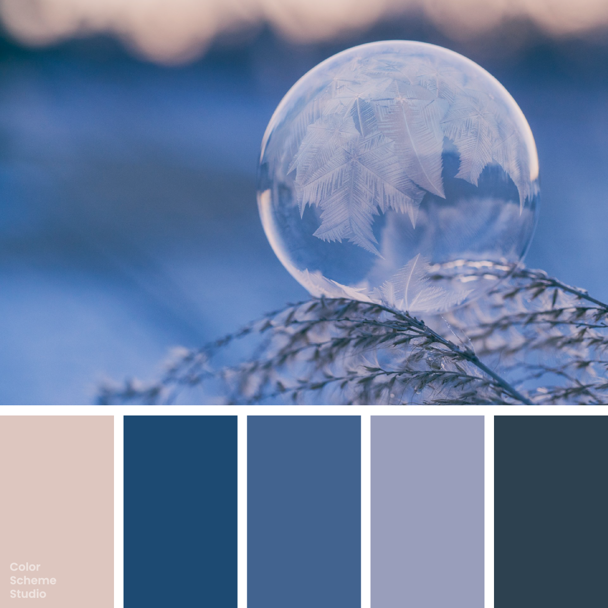
Winter frosted color palette
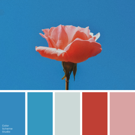
A frozen bubble pairs rose-tinted light with layered winter blues. Copy five colors and explore a frost journal, a seasonal exhibition card, and a stationery sleeve.
The palette
Click a hex to copyRGB & CMYK values
| Color | Hex | RGB | CMYK (approx.) |
|---|---|---|---|
| Thaw Blush | #DDC6BF | 221 198 191 | 0 10 14 13 |
| Glacier Blue | #1D4A72 | 29 74 114 | 75 35 0 55 |
| Crystal Denim | #42638F | 66 99 143 | 54 31 0 44 |
| Frost Lavender | #999EBB | 153 158 187 | 18 16 0 27 |
| Winter Slate | #2D4150 | 45 65 80 | 44 19 0 69 |
FROM INSPIRATION TO APPLICATION
Keep the fragile detail and the broad blur separate.
Aaron Burden’s photograph gives the ice crystals a sharp, branching pattern while the blue setting falls out of focus. The pale rose light near the top softens that cool field. Translate the difference in detail into a layout: leave an open area for reading, use a blue panel for structure, and let the photograph supply the intricate texture. Repeating frost patterns behind every line would work against the clarity that makes the bubble visible.
Three formats for a fleeting winter moment.
A field journal needs room for observations and a date. A small exhibition announcement needs a title someone can read at a glance. A stationery sleeve needs one recognizable front face. Compare blush, glacier, and lavender-led versions below. The same palette can feel airy or enclosed depending on which field grows; the photograph’s transparent appearance does not mean the text should also be pale.
held still.
Small notes from a changing season.
Read the field notes ↗01 / A frost observation journal
Give notes and dates an untextured blush panel. The blue edge can mark the season while the photograph keeps its detailed ice crystals.
LIGHT
02 / A seasonal exhibition card
A short glacier-led face can introduce a photographic series. Keep dates, opening times, and other small information on a separate checked panel.
LIGHT
A place for
quiet observations.
notes.
03 / A stationery sleeve
Use a lavender front, a glacier side, and a small blush seal. Avoid repeating the crystal texture behind the product name.
Original illustrative design studies, not real businesses, event announcements, or production packaging files.
Build the light area before adding the blues.
Start with Thaw Blush 44%, Glacier Blue 24%, Winter Slate 16%, Crystal Denim 11%, and Frost Lavender 5%. The blush field recalls the reflected light without imitating clear ice. Glacier Blue carries the strongest colored structure, slate supplies reading text, and denim adds a middle layer. Lavender is a small atmospheric bridge. These areas are an illustrative composition, not measurements of how many pixels belong to the bubble.
#DDC6BFA journal page or an inset for practical exhibition details.
#1D4A72A cover, a structural panel, or a checked action field.
#2D4150Body copy and thin rules on the checked blush surface.
#42638FA divider, an illustration layer, or a secondary cover band.
#999EBBA decorative inset or small shape; check text before using it as a label.
A pale surface still needs a solid foreground.
White lettering on Thaw Blush loses definition. Winter Slate on the same blush field creates a much stronger reading pair, as the comparison below shows. Do not extend that result to every pale color: slate on Frost Lavender falls below 4.5:1 for normal text. Keep long notes on the checked blush surface, or use a separately checked darker ink when lavender must carry small words.
Below AA for normal text.
Meets AA for normal text.
The WCAG AA minimum for normal text is 4.5:1. Ratios describe these exact solid-color pairs, not the whole page or text over the photograph. How to keep muted color palettes readable →
Take this color direction into your project.
Start with named roles, then check each new text and surface pairing.
/* Winter frosted color palette: sRGB starting values, not print specifications. */
:root {
  --frost-surface: #DDC6BF;
  --frost-ink: #2D4150;
  --frost-support: #1D4A72;
  --frost-detail: #999EBB;
  --frost-accent: #1D4A72;
  --frost-on-accent: #DDC6BF;
}
.frost-cover { background: var(--frost-surface); color: var(--frost-ink); }
.frost-action { background: var(--frost-accent); color: var(--frost-on-accent); }
/* Add a checked reading surface for extended body copy. */
Use frost as the subject, not the reading surface.
For the journal, place the photo beside a clean text field and use denim for a rule or page marker. For an announcement, let a deeper blue cover carry a short pale headline; move practical details onto the blush inset. For a stationery sleeve, lavender can cover a broad face while slate remains a structural edge. Add the real date and smallest caption before approving the layout. A printed photograph will not have the same luminous depth as a screen; check the chosen stock and output profile rather than relying on approximate CMYK values.
Photo by Aaron Burden on Unsplash. Color studies and application notes by Color Scheme Studio.