Spring / Pastel
Spring soft color palette
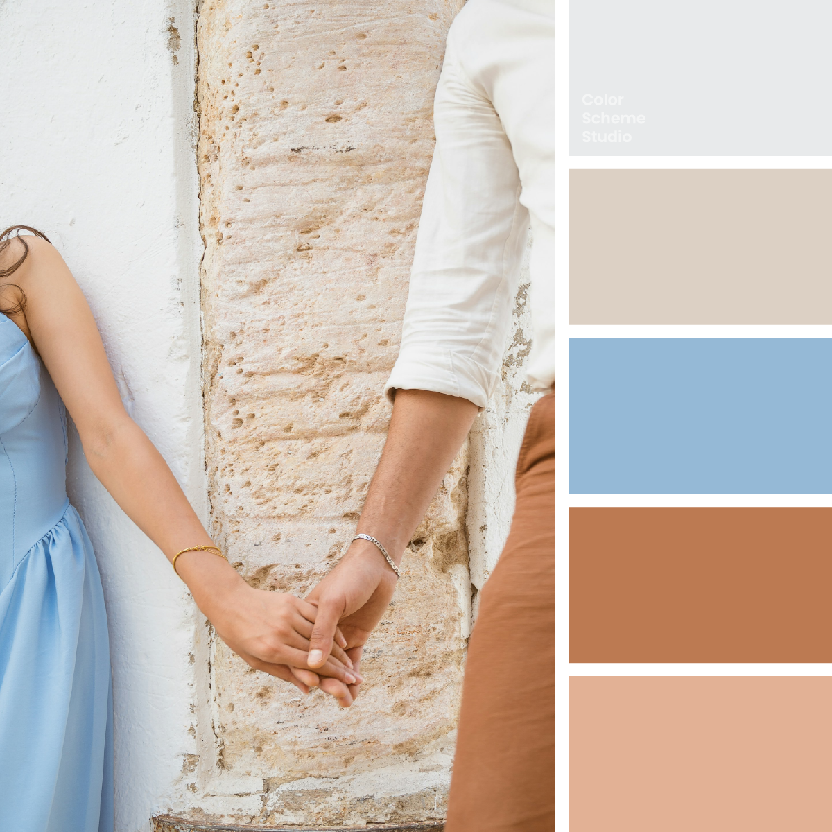
Powder blue fabric, pale stone, and warm clay turn a hand-in-hand portrait into a soft spring palette. Explore a celebration page, a details card, and a keepsake sleeve.
The palette
Click a hex to copyRGB & CMYK values
| Color | Hex | RGB | CMYK (approx.) |
|---|---|---|---|
| Linen White | #E8EAEB | 232 234 235 | 1 0 0 8 |
| Sandstone Veil | #DCD0C4 | 220 208 196 | 0 5 11 14 |
| Vow Blue | #95B9D6 | 149 185 214 | 30 14 0 16 |
| Terracotta Thread | #BC7A52 | 188 122 82 | 0 35 56 26 |
| Apricot Silk | #E2B195 | 226 177 149 | 0 22 34 11 |
FROM INSPIRATION TO APPLICATION
Let the connection lead the composition.
In Chermiti Mohamed’s photograph, the hands meet near the lower middle of the frame. Pale stone divides the clothing, with cool blue on one side and warmer fabric and skin tones on the other. The palette supports that meeting rather than creating a new focal point. Use the pale neutrals for the message, blue for a recognizable thread, and warm clay for a restrained graphic detail. The wedding-style studies below are possible applications, not a claim about the occasion in the source photograph.
Carry one color thread across three pieces.
A celebration page helps someone find the essential information. A details card repeats the useful facts in a smaller format. A keepsake sleeve gathers those pieces after the occasion. Compare linen, blue, and sandstone-led fields while the hierarchy stays fixed. Each piece should feel related without assigning all five colors the same amount of space. Use the actual names and dates when testing the design; a graceful short example is not a guarantee that a longer message will fit.
Our people.
The details that bring everyone together.
See the details ↗01 / A celebration information page
Keep the names and one primary action clear on linen. Let blue connect the page to the printed pieces, with clay confined to the simple motif.
TO KEEP
02 / A printed details card
Use the blue-led version for a short cover. Put directions and longer schedules on a pale reverse with supporting dark ink.
STORY
For the details
we want to keep.
always.
03 / A keepsake sleeve
A sandstone face can bring warmth without repeating the photograph. Use a blue seal with dark lettering and keep clay as a modest structural accent.
Original illustrative design studies, not real businesses, event announcements, or production packaging files.
Treat the neutrals as two different materials.
Try Linen White 46%, Sandstone Veil 24%, Vow Blue 18%, Terracotta Thread 8%, and Apricot Silk 4%. Linen opens the reading area; sandstone suggests the architectural setting and gives secondary panels a warmer edge. Blue connects the separate pieces. Clay can act as a small marker or illustration, while apricot keeps the warm details gentle. These are layout proportions, not a measurement of clothing, skin, or stone in the photo.
#E8EAEBA clear surface for names, dates, and practical directions.
#DCD0C4An inset or sleeve side that recalls the stone setting.
#95B9D6A cover field or a dark-lettered action shared across the set.
#BC7A52A small motif or marker, rather than a default text color.
#E2B195A seal or supporting shape that stays subordinate to the message.
Soft colors need an additional reading ink.
None of these five inspiration colors is a deep reading neutral. Add supporting ink #283D42 instead of forcing clay or white into every text role. White on Vow Blue is too faint for normal text; the dark supporting ink on the same blue is much clearer. This comparison is about the specified solid pair. Fine script, thin strokes, and words over the textured stone still require their own review.
Below AA for normal text.
Meets AA for normal text.
The WCAG AA minimum for normal text is 4.5:1. Ratios describe these exact solid-color pairs, not the whole page or text over the photograph. How to create a wedding color palette across digital and print →
Take this color direction into your project.
Start with named roles, then check each new text and surface pairing.
/* Spring soft color palette: sRGB starting values, not print specifications. */
:root {
  --vow-surface: #E8EAEB;
  --vow-ink: #283D42;
  --vow-support: #BC7A52;
  --vow-detail: #E2B195;
  --vow-accent: #95B9D6;
  --vow-on-accent: #283D42;
}
.vow-cover { background: var(--vow-surface); color: var(--vow-ink); }
.vow-action { background: var(--vow-accent); color: var(--vow-on-accent); }
/* Add a checked reading surface for extended body copy. */
Keep the identity steady when the material changes.
Use blue for a stable identity cue across the page, card, and sleeve, then let the amount of linen and sandstone respond to the format. A screen button can use dark ink on blue; an invitation may be clearer with dark text directly on a pale sheet. Do not use apricot as a skin-color specification or promise that blue will print like the fabric. Photograph lighting and paper change the result. Ask the printer about the stock and color profile, and compare a proof before ordering a set.
Photo by Chermiti Mohamed on Unsplash. Color studies and application notes by Color Scheme Studio.