Summer / Vintage
Vintage earthy color palette
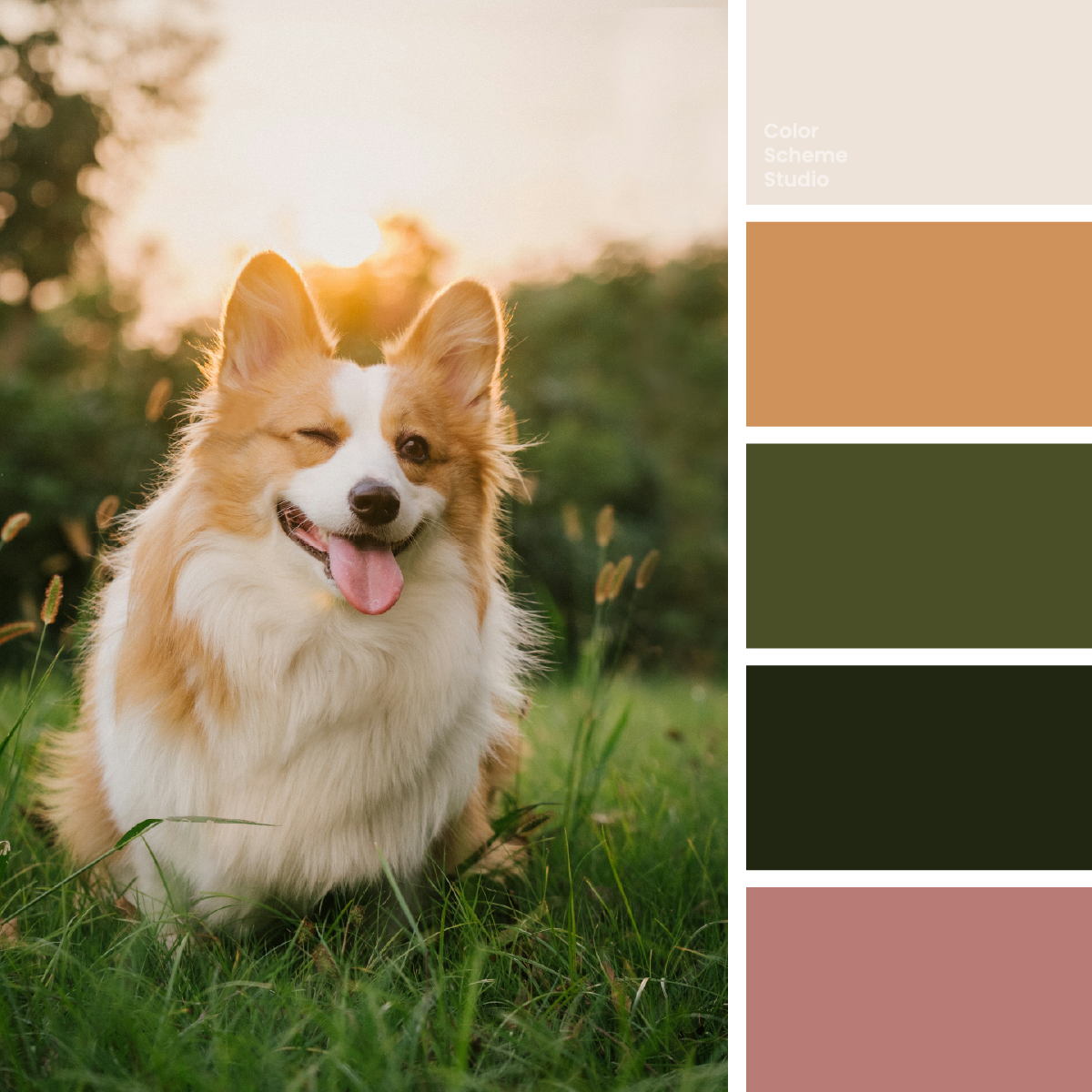
Cream fur, sunlit tan, and olive grass give this corgi-inspired palette a friendly, earthy character. Try a pet journal, a portrait card, and a keepsake sleeve.
The palette
Click a hex to copyRGB & CMYK values
| Color | Hex | RGB | CMYK (approx.) |
|---|---|---|---|
| Oat Cream | #EDE3D9 | 237 227 217 | 0 4 8 7 |
| Sunlit Biscuit | #CF925B | 207 146 91 | 0 29 56 19 |
| Meadow Olive | #4B4F27 | 75 79 39 | 5 0 51 69 |
| Woodland Ink | #212613 | 33 38 19 | 13 0 50 85 |
| Playful Blush | #B87B76 | 184 123 118 | 0 33 36 28 |
FROM INSPIRATION TO APPLICATION
Keep the character, not just the golden light.
Alvan Nee’s portrait is full of warm evening light, but the corgi remains distinct from the setting. Pale fur opens up the face and chest, tan describes the ears and coat, and dark olive grass frames the animal. A small dusty pink echoes the tongue. Carry that separation into a design: a clear pale area for the message, warmth around the subject, and darker green where the composition needs an edge. The palette should recall an individual portrait rather than turn every surface into a generic golden wash.
Give a pet story three different forms.
A journal entry needs room for a photograph and a short anecdote. A portrait card needs a name that reads before the decorative marks. A keepsake sleeve needs enough structure to feel like one small collection. These studies translate the photograph into those formats. Compare cream, olive, and biscuit-led surfaces while keeping the same wording and graphic positions; a warm color does not have to cover the largest area to make the piece feel welcoming.
small stories.
Walks, portraits, and ordinary joys.
Read the journal ↗01 / A pet journal
Let the photograph introduce the character. Use cream around the story and one olive reading link, with biscuit confined to a supporting illustration.
FRIEND.
02 / A portrait keepsake card
Make the name the clearest element. An olive-led face can feel like an outdoor portrait without adding grass textures behind the words.
COMPANY
For the moments
you want to keep.
moments.
03 / A keepsake sleeve
Give the front a biscuit-colored field and use olive for the side. A pink seal adds a small playful mark; keep the animal’s name and date in dark lettering.
Original illustrative design studies, not real businesses, event announcements, or production packaging files.
Let the pale fur create breathing room.
For a first layout, try Oat Cream 48%, Meadow Olive 24%, Sunlit Biscuit 18%, Woodland Ink 7%, and Playful Blush 3%. Cream preserves the open feeling around the face. Olive connects the layout to the grass, while tan keeps the subject’s warmth visible. Ink provides reading text and small structural lines. Pink is a small identifying detail, not an automatic button color. These proportions are a design suggestion, not a measurement of the image.
#EDE3D9A reading surface and a calm margin around the portrait.
#4B4F27A cover field, an illustration silhouette, or a checked action surface.
#CF925BThe sleeve front or a single rounded graphic beside the story.
#212613Reading text on cream, dates, fine rules, and dark-on-pink labels.
#B87B76A small tab, dot, or edition seal that echoes the tongue.
A dusty pink label needs more than a friendly mood.
Playful Blush looks gentle against cream and olive, but white text on it is too faint for normal reading. Compare white and Woodland Ink on the same pink background below. Use the darker foreground for a short portrait label or an edition seal. If the pink detail has no informational job, it can simply remain a decorative dot; a color does not need to carry words to belong in the system.
Below AA for normal text.
Meets AA for normal text.
The WCAG AA minimum for normal text is 4.5:1. Ratios describe these exact solid-color pairs, not the whole page or text over the photograph. How to choose colors from a photo without losing the subject →
Take this color direction into your project.
Start with named roles, then check each new text and surface pairing.
/* Vintage earthy color palette: sRGB starting values, not print specifications. */
:root {
  --corgi-surface: #EDE3D9;
  --corgi-ink: #212613;
  --corgi-support: #4B4F27;
  --corgi-detail: #CF925B;
  --corgi-accent: #4B4F27;
  --corgi-on-accent: #EDE3D9;
}
.corgi-cover { background: var(--corgi-surface); color: var(--corgi-ink); }
.corgi-action { background: var(--corgi-accent); color: var(--corgi-on-accent); }
/* Add a checked reading surface for extended body copy. */
Protect the portrait when adding the next element.
Begin with the cream-led journal if the photograph is the main attraction. Try an olive cover for a compact portrait card, or biscuit for the broad face of a keepsake sleeve. Add one real name and one real line of copy before extending the design: long pet names, captions, and dates quickly expose whether there is enough space. Keep warm decoration away from the face in a photo-led layout. Before printing, confirm the paper and output profile; soft cream and muted pink can shift, and the approximate CMYK values here do not replace a proof.
Photo by Alvan Nee on Unsplash. Color studies and application notes by Color Scheme Studio.